The colors in Furniture – RED
The colors in Furniture – RED
The colour plays an essential role in the furnishings of a house. It represents its own essence and it transmit feelings.
I do not pretend to provide you a complete guide of all the possible shades. At least, I want to indicate which are the most appropriate colours to the different rooms or the most appropriate stile for an house.
Red is one of the most used colour in graphics for its vitality’s characteristics. It represents love, but overall, male vitality and it is a primary colour.
It has the power to increase blood pressure, respiratory rate and it stimulates hunger. It isn’t, in fact, a case that the business colour of brands like McDonald, Coca-Cola and Barilla is red.
It is said that red is the first colour that children learn to recognize.
The Feng Shui recommends to paint the house’s front door in red, to wish prosperity to the residents.
Red is a vibrating and warm colour and for this reason it is perfect to put it in the rooms facing towards North.
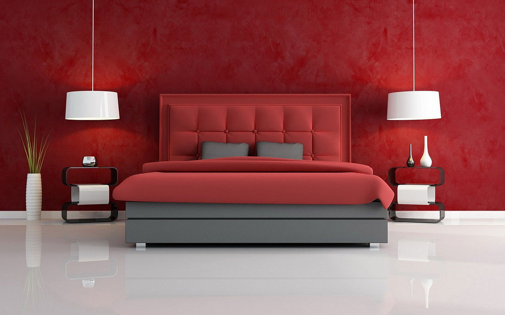
If the room is little and dark, it is not recommended to paint the walls in this colour, because it tends to shrink spaces. On the other hand, it isn’t a relaxing colour, so it is better to use it with moderation.
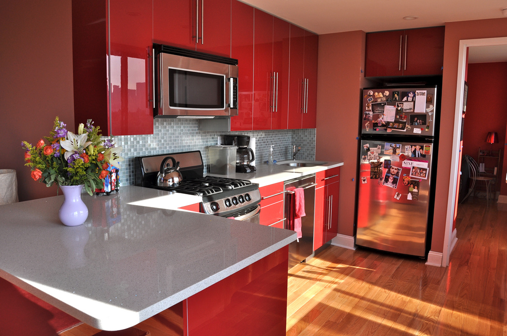
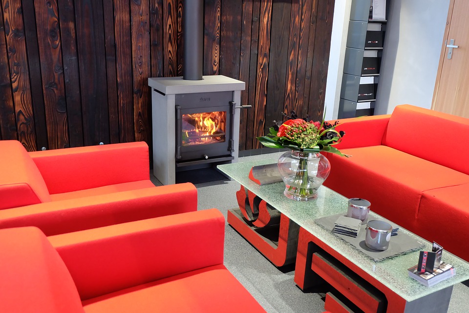
As we said before, red colour teases the appetite, so we can use it in rooms like the living room and the kitchen. In bedroom is better to limitate it for pillows and complements.
If you want my personal thought (Alice), this is not a colour that I particularly like. I find it appropriate only in very big rooms or if it is udes with moderation, only for furnishings.
In the blog DeaByDay (references below) they say that red gives exceptional results if it is combined with natural colours like beige and biscuit colours, with gray colours like dark slate and bright green colours like mint.
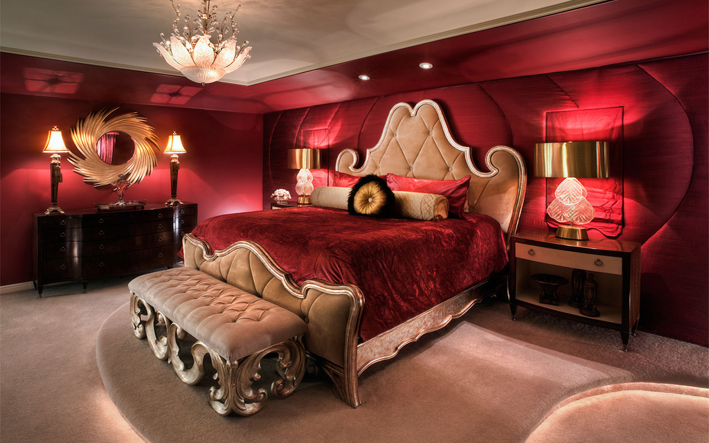
If it is combined with gold or golden walls, red gives to the atmosphere a luxurious and royal aspect. If, instead, you want to mitigate the electricity it is necessary to damp it associating it to neutral tonalities like brilliant white and buttery tonalities.
But warning, it is the colour of danger (inherited characteristic from the ancient fear of fire) and it is, in fact, on road signs, like Stop one.
Shall we remember that, in addition to the association with blood, it has contraindications like, for example, the fact that it can get the eyes really tired. Red can cause insomnia and it can increase blood pressure. So, it has to be used with moderation.
For a closer look at the color RED click the following link RED.
For a closer look at the color YELLOW click the following link YELLOW.
For a closer look at the color BLUE click the following link BLUE.
For a closer look at the color BROWN click the following link BROWN.
For a closer look at the color GREEN click the following link GREEN.
For a closer look at the color ORANGE click the following link ORANGE.
For a closer look at the color VIOLET click the following link VIOLET.
For a closer look at the color PINK click the following link PINK.
For a closer look at the color GREY click the following link GREY.
For a closer look at the color WHITE click the following link WHITE.
For a closer look at the color BLACK click the following link BLACK.
If you are interested in my decorating or interior design articles, follow my blog in the “Furniture & Interior Design” section where you will find all the information. Links Blog di Alice – Furnishing & Interior Design
If I can be useful with any information, do not hesitate to contact me at info@ortalloggi.com
Alice – www.ortalloggi.com
Sources:
- caseeinterni.blogspot.it “uso del colore rosso”;
- grafigata.com “come scegliere il colore del logo”;
- deabyday.tv “come arredare con il rosso”;
Photos in the gallery are taken by me during some photo sessions in my homes, or taken from google images, with open source license.

